Learning + Fun
In my previous role at Boavi, a company I founded, I had the opportunity to lead the complete transformation of Mr. Nussbaum, a prominent educational website known for its interactive games, visuals, and readings for primary grade students. The site, serving millions of users monthly, had grown rapidly over the years, creating significant challenges in user experience, site organization, and branding coherence.
As the lead UX researcher, designer, and branding expert on the project, my team and I undertook the dual task of revamping Mr. Nussbaum’s brand identity while redesigning the website to improve functionality and accessibility. The goal was to create a cohesive, engaging, and intuitive experience that catered to the needs of students, parents, and educators. This case study highlights my strategic approach and leadership in both the branding and website redesign, showcasing how these two critical elements were integrated to create a seamless user journey.
Below, I detail the work done in two key areas: Branding Revamp and Website Redesign. Each showcases the distinct yet interconnected efforts that brought Mr. Nussbaum to the forefront as a vibrant, user-friendly educational platform.
Branding Revamp
As part of the comprehensive overhaul of Mr. Nussbaum, the branding aspect was critical in redefining the website's visual identity and appeal. My role was to ensure the brand's essence was aligned with the educational goals of Mr. Nussbaum, making it visually engaging and relatable for students, parents, and educators alike.
Mr. Nussbaum’s existing branding was outdated and failed to connect with its primary audience—children in primary grades. The visual elements were inconsistent, and the overall look lacked the excitement and engagement necessary to capture young learners' attention. The branding needed a complete refresh to make the site more inviting, consistent, and reflective of its educational mission.
Objectives
- Create a visually engaging brand that resonates with primary grade students and their educators.
- Develop a cohesive visual identity, including logo, color palette, and typography, that reflects the fun, creative, and educational spirit of Mr. Nussbaum.
- Ensure the branding is inclusive and appealing to a diverse audience, promoting gender neutrality and broad accessibility.
Solution
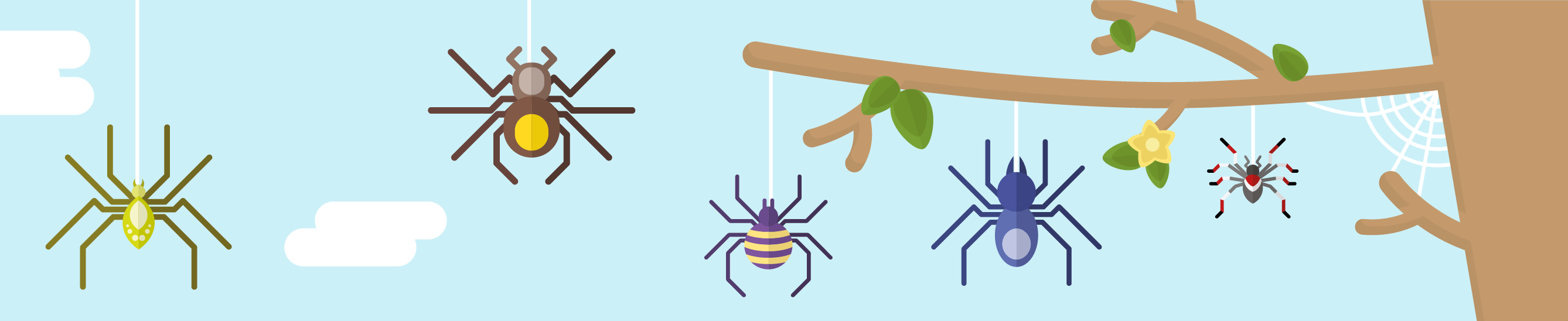
- Logo Design: We crafted a playful yet professional logo that captured the essence of learning and exploration. The new logo design featured child-friendly elements that balanced fun with educational credibility.
- Color Palette: A vibrant, inclusive color palette was selected, featuring a mix of bright and neutral tones that appealed to children without being overly gender-specific. The colors were chosen to evoke creativity, joy, and focus, aligning with the site's goal to make learning enjoyable.
- Typography: We introduced friendly, easy-to-read typefaces that were legible for young readers. The typography was carefully chosen to be both accessible and engaging, ensuring that the content was approachable for all users.
- Visual Elements: Custom illustrations, icons, and imagery were designed to add personality to the site. These visuals were strategically placed to guide users through the content, creating an engaging learning environment that kept users’ attention.
- Consistent Brand Application: We applied the new branding consistently across all touchpoints, from the homepage to subpages, ensuring a cohesive user experience. This helped build a strong brand presence that reinforced Mr. Nussbaum's educational mission.


Website Redesign
While the branding work set the visual tone, the website redesign was crucial to improving the overall functionality, usability, and accessibility of Mr. Nussbaum. This part of the project focused on enhancing the user experience through strategic site architecture, intuitive navigation, and responsive design, showcasing my skills as a website designer and UX strategist.
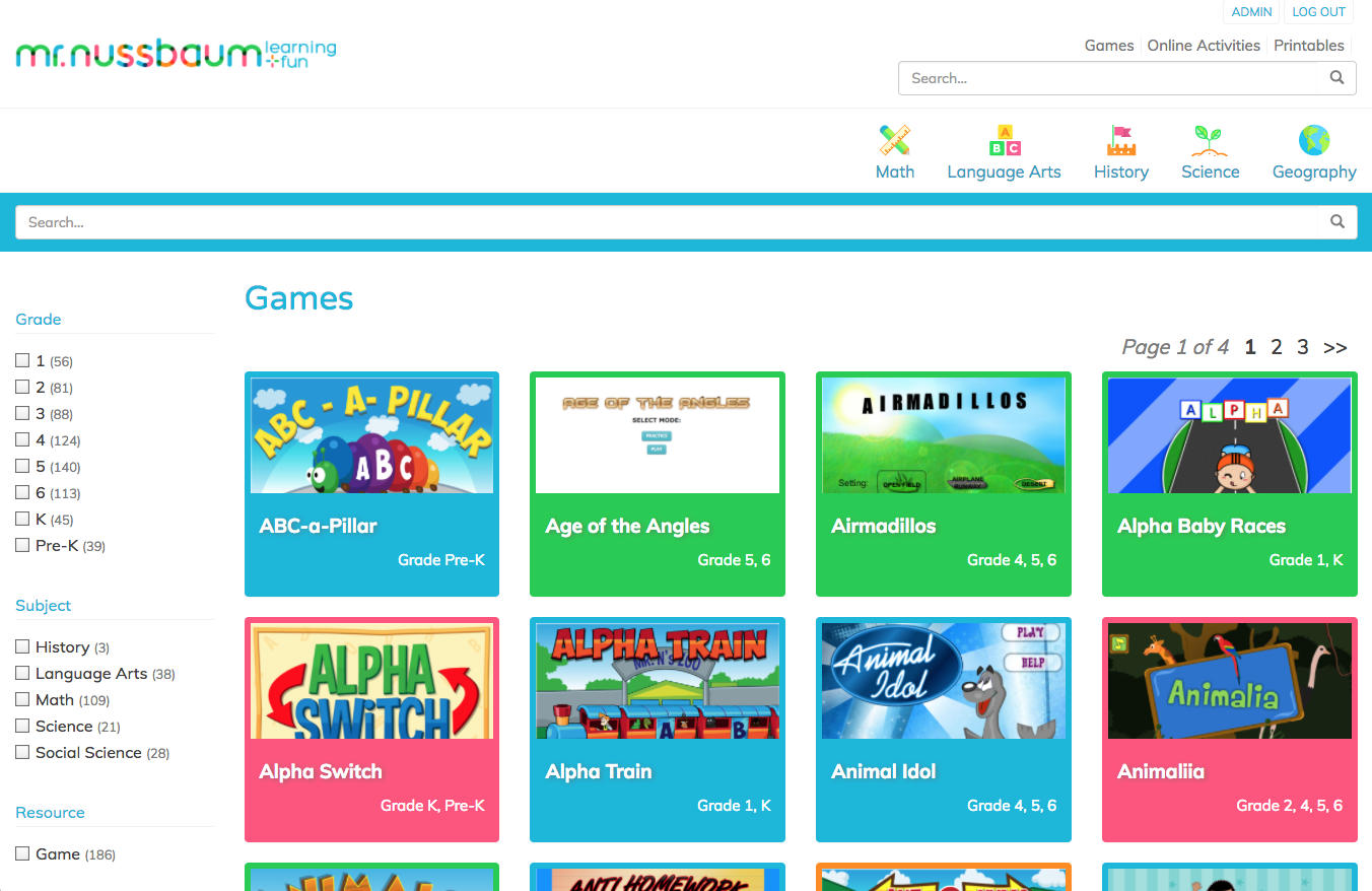
Mr. Nussbaum's rapid growth had led to a cluttered site with poor navigation and inadequate backend functionality. The site’s structure made it difficult for users to find relevant content, and the outdated design did not support modern devices or the varied needs of students, teachers, and parents.
Website Objectives
- Simplify site navigation to make it more intuitive and user-friendly for different user groups.
- Design a responsive and scalable website that works seamlessly across desktops, tablets, and mobile devices.
- Improve backend functionality to allow for easy content updates, customization, and user management.
- Incorporate interactive elements that support Mr. Nussbaum’s mission to foster a love of learning.
Solution
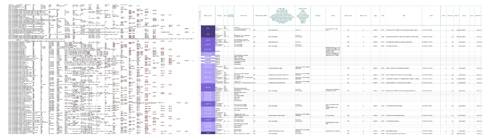
- Research and Strategy: We conducted an extensive competitive analysis to identify best practices in educational websites. The research helped us define the information architecture and navigation structure, ensuring the redesign was guided by data-driven insights.
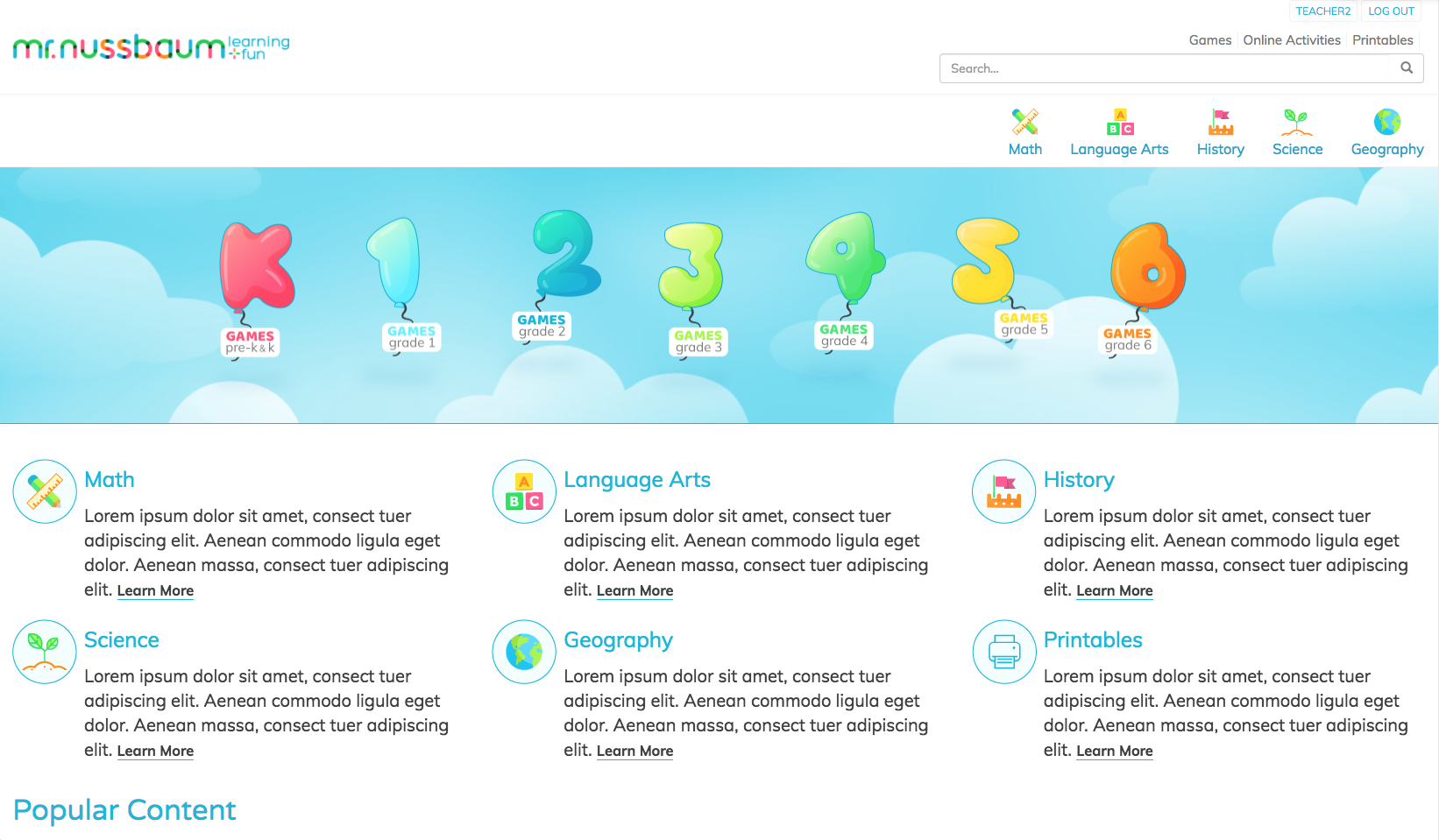
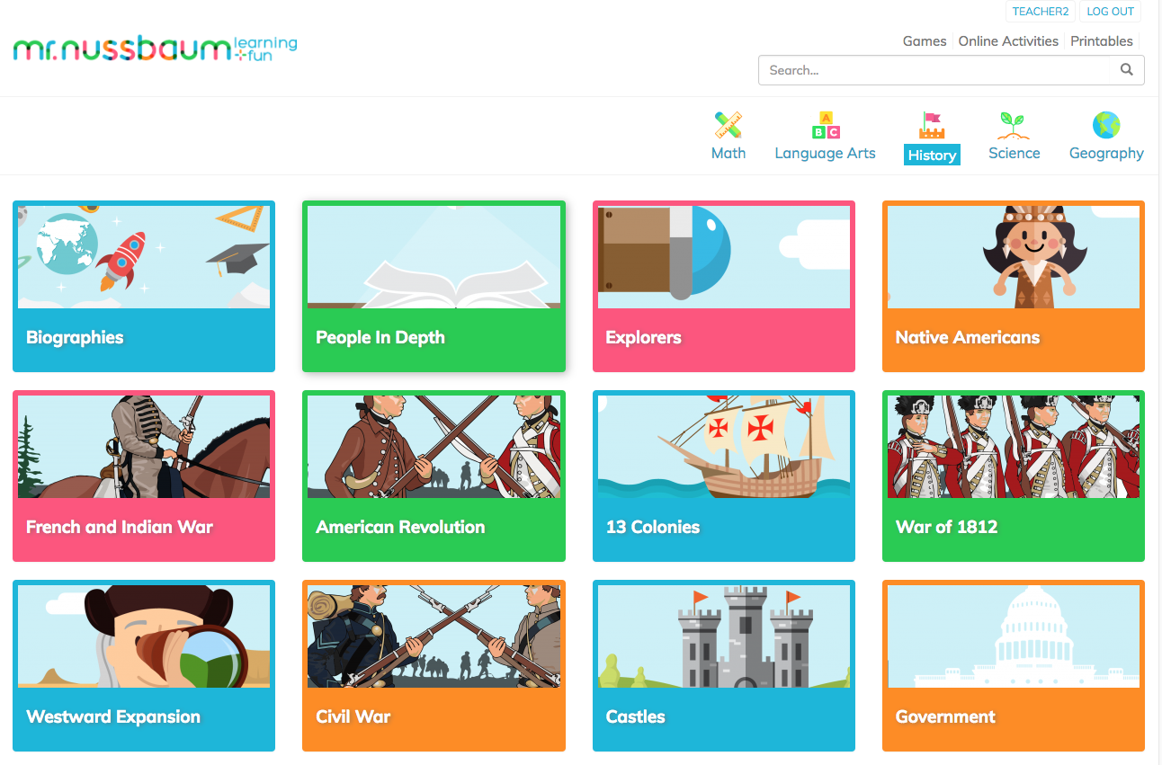
- Information Architecture: A new site structure was developed, allowing users to easily navigate through five levels of content without feeling overwhelmed. This involved reorganizing pages, implementing multi-level filters, and creating an intuitive menu system with sticky navigation for easy access.
- Backend Development: We built a new backend that supported user logins, membership management, and content customization. The updated backend allowed teachers to create personalized experiences for students, enhancing the overall value of the site.
- Responsive Design: The entire site was redesigned to be fully responsive, ensuring optimal usability on various devices. This was particularly important as more users accessed the site via tablets and smartphones.
- Interactive Features: To make the site more engaging, we added interactive elements such as hover effects, faceted search, and quick access links. These enhancements made it easier for users to explore the site’s vast content.
- Wireframing and Prototyping: Detailed wireframes and prototypes were created to visualize the new layout and navigation. Multiple design iterations were tested with user personas to refine the experience before moving into development.
- Visual Consistency and Layout: We standardized the design language across all pages, creating a uniform look and feel. The layout was simplified, emphasizing content hierarchy and making it easy for users to find what they were looking for.
Reflections
Reflecting on the Mr. Nussbaum project, it was a rewarding experience that underscored the power of aligning branding with user-centric design to create a compelling digital experience. Leading this project at Boavi allowed me to combine my expertise in both branding and UX design, demonstrating how thoughtful design decisions can profoundly impact user engagement and satisfaction.
One of the key takeaways from this project was the importance of a holistic approach—understanding that branding and website functionality are not separate entities but deeply interconnected elements that shape the overall user experience. By redesigning the brand identity to resonate with young learners and revamping the website to enhance usability, we were able to create a unified, engaging platform that effectively met the needs of all user groups.
Additionally, this project reinforced the value of research-driven design. From competitive analyses to persona testing, every step of the process was informed by insights that helped us make strategic decisions, ensuring that the final product was not only visually appealing but also functionally robust and easy to use.