WorkCase study
From inventory dashboards to actionable reconciliation
How I reframed a dashboard migration around the work users actually needed to do, separated a validated workflow from a requested capability, and used coded prototypes to move research, design, and engineering forward.
- My role
I reframed the product around the validated reconciliation workflow, led research and interaction design, built and tested coded prototypes, aligned product and engineering around the direction, and developed a working implementation for the frontend team.
- Team
UX, Product, architecture, engineering, process owners, content, delivery, and tool specialists
- Timeline
Three weeks
- Core constraint
Engineering needed a direction it could build while research, requirements, and the broader comparison model were still evolving.
- Strategic decision
I separated a workflow we understood from a capability stakeholders wanted but users had not yet demonstrated consistently.
Rather than let generic multi-tool comparison become the organizing model for the product, I recommended going deep on the validated inventory system-to-tool workflow while leaving room for broader comparison to evolve.
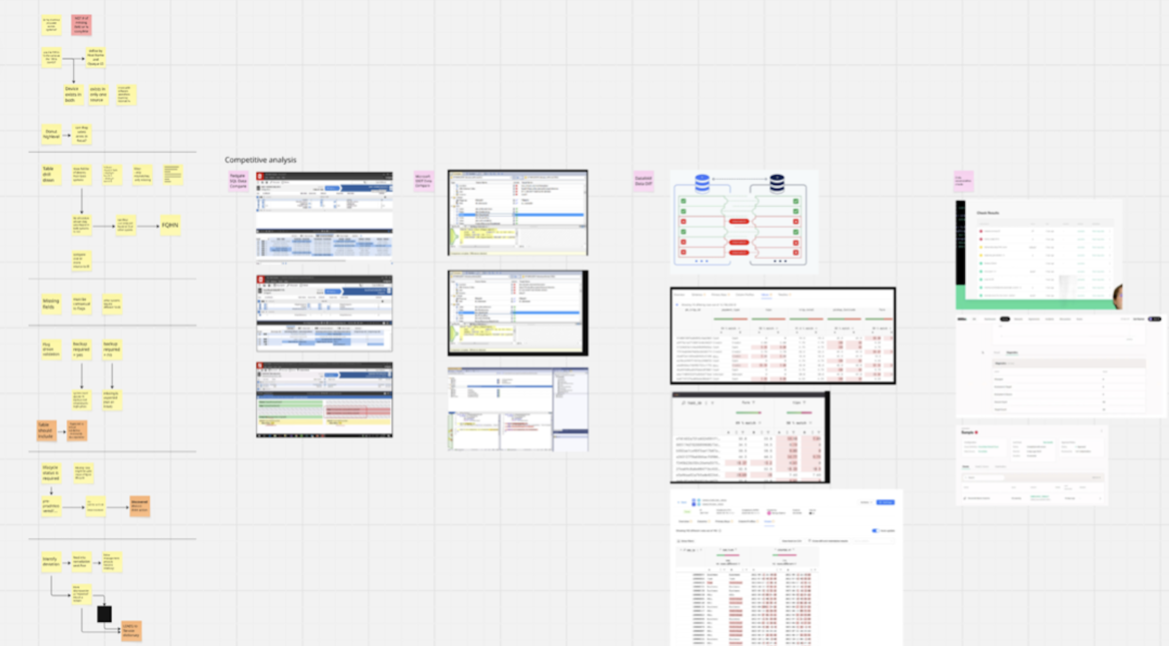
Confidentiality note: Product terminology, research data, navigation structures, interface details, and implementation specifics have been anonymized, modified, or recreated. Visuals have also been modified and presented at a lower resolution, while remaining representative of the original work and workflow.
Intro
The Inventory reconciliation experience was initially approached as a dashboard migration and enhancement effort.
The existing dashboard experience exposed comparisons, match counts, and discrepancies, and the expectation was that the new experience would preserve those capabilities while moving into the new design system.
Research changed the problem.
The dashboard was not how users actually reconciled inventory. Their work happened after a discrepancy appeared: determining what was missing, whether the difference was a genuine issue or a legitimate exception, why it existed, and what should happen next.
I reframed the product around that job.
As the lead UX researcher and designer, I led discovery, product framing, interaction design, usability testing, coded prototyping, stakeholder alignment, and implementation planning. I also used my development background and Cursor to build realistic prototypes and ultimately a working implementation with real data, which I pushed to the frontend engineering team to use.
The result was not simply a redesigned dashboard. It was a clearer model for what the product should help users decide, which workflows were supported by evidence, and where the team still needed to learn.
Impact at a glance
23 target-workflow participants
All participants who were directly involved in the reconciliation workflow expressed a need for inventory system-to-tool reconciliation and could describe the surrounding work.
4–8 hours → about 10 minutes
Participants described a recurring reconciliation process that could consume several hours each week. In usability testing, the redesigned workflow reduced the same task to minutes.
8 prototype iterations
Eight prototype versions allowed the interaction model to evolve with research and usability feedback.
The design moved progressively away from dashboard-style reporting and toward discrepancy investigation, interpretation, and action.
Product direction changed
The work reframed the product from recreating a comparison dashboard to helping users understand discrepancies, make decisions, and take action.
Reconciliation became the evidence-backed foundation, while broader comparison stayed flexible until the workflow was better understood.
Working implementation for engineering
I built the validated experience and pushed it as a working reference for frontend engineering.
This gave the team both usable code they could build from and a representation of the intended states, interactions, and behavior rather than relying only on static design specifications.
What I am not claiming
I do not have verified post-launch analytics showing measured reductions.
The “hours of manual reconciliation to minutes” comparison is based on usability testing against participants’ reported workflows. I treat it as a strong validation signal for the redesigned experience and not as a measured production outcome.
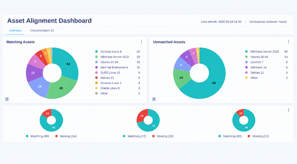
The dashboard showed discrepancies. It did not help users resolve them.
The original experience centered on totals, matches, mismatches, and high-level widgets.
That created visibility, but visibility was only the beginning of the job.
A discrepancy did not necessarily indicate a problem. Some differences represented legitimate operational exceptions, so users needed enough context to distinguish issues requiring action from expected differences.
A red mismatch count could therefore create more investigation without creating more understanding.
Users were compensating outside the product.
Participants described downloading information from multiple systems, manipulating datasets, and manually comparing them.
Other recurring inventory system comparisons were performed approximately weekly and could consume several hours or as much as a working day. Larger datasets became increasingly difficult to reconcile manually.
The opportunity was not simply to surface discrepancies faster.
It was to help people determine which discrepancies actually required attention and what they should do next.
The real workflow happened after the mismatch
Research showed a sequence that the dashboard did not support well:
- Identify a gap
- interpret the difference
- investigate fields and flags
- determine if action is needed
- document the issue
- move to remediation
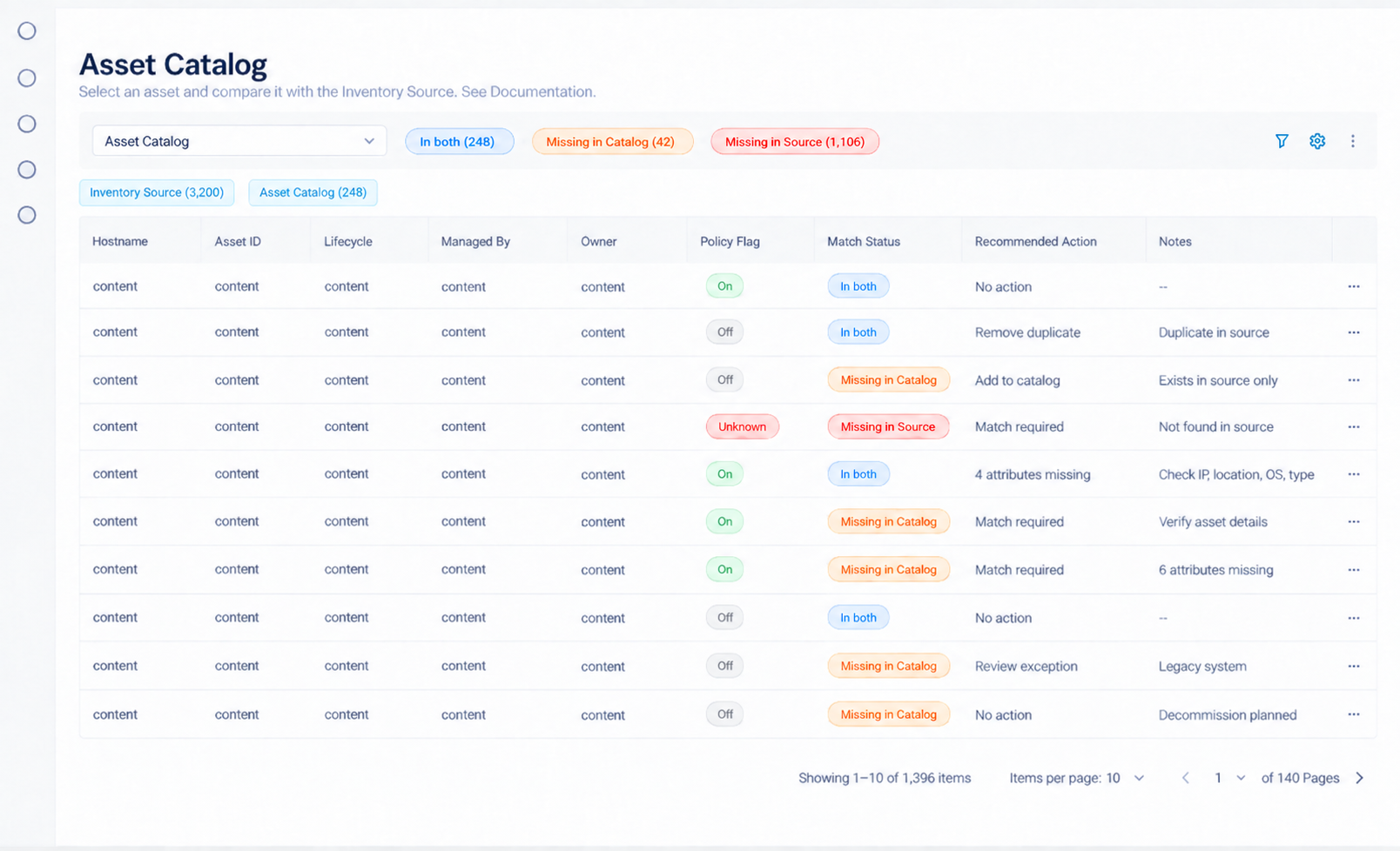
That changed how I thought about the product.
Instead of organizing the experience around dashboard widgets, I began organizing it around the decisions users needed to make.
The core question became:
What information does someone need to move from “these systems disagree” to “I understand why, and I know what should happen next”?
What the evidence changed
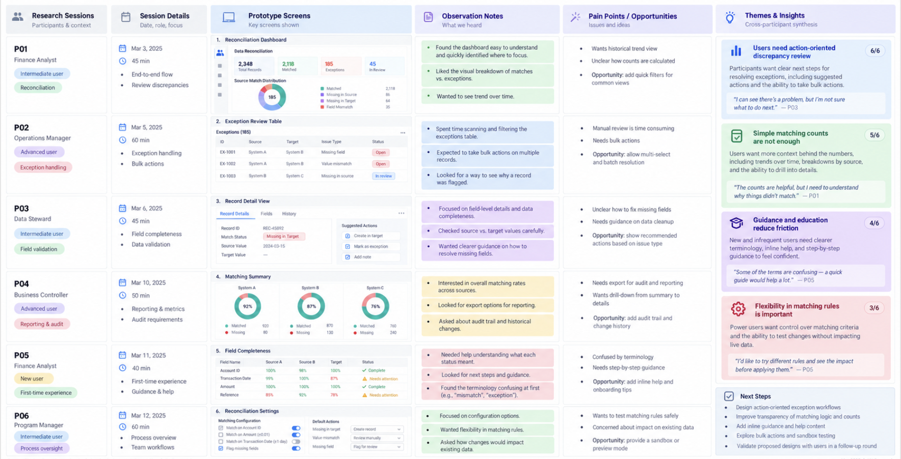
The strongest and most consistent research signal supported inventory system-to-tool reconciliation.
Across four stakeholder-provided participant lists, I spoke with 23 people. And all expressed a need for inventory system-to-tool comparison and could describe the surrounding work.
They could explain:
- why they were comparing the systems,
- what a missing resource might mean,
- how they decided whether a difference was legitimate,
- what information they investigated,
- and what happened after they identified a discrepancy.
That gave me enough behavioral evidence to design the workflow with confidence.
The evidence for broader multi-tool comparison was different.
Stakeholders wanted the inventory reconciliation experience to support more flexible comparisons across operational tools, but the research had not yet surfaced users who could consistently describe the complete generic workflow from comparison → decision → action.
That difference became central to the project.
Decision
I chose not to let generic multi-tool comparison become the primary organizing model simply because it was technically possible and requested by stakeholders.
As an experience, it introduced unresolved questions:
- What decision is someone making by comparing those particular tools?
- Are all combinations meaningful?
- If neither system is the baseline, what exactly does a mismatch represent?
- Which fields provide a valid basis for comparison?
- What action should follow?
- How should legitimate exceptions be represented?
- Can the interface offer anything more useful than mismatch totals and repeated hostnames?
Instead, I made the validated reconciliation workflow the actionable foundation while leaving room for broader comparisons.
The experience moved from high-level dashboard widgets toward:
- select
- filter
- inspect
- interpret
- decide
- act
- document
Outcome
The team's framing shifted to:
“What does this discrepancy mean, what decision does the user need to make, and what should happen next?”
Three possible directions
1. Reproduce the existing dashboard
Benefit: Fastest path to feature parity and multi-tool comparison capability.
Risk: We would recreate the original problem: an interface that displayed discrepancies without helping users understand or act on them.
2. Support only inventory system-to-tool reconciliation
Benefit: Strongest research confidence, a known baseline, meaningful discrepancy logic, and identifiable next actions.
Risk: It would ignore a broader product capability that stakeholders considered important.
3. Build an actionable foundation and expand deliberately — recommended
Benefit: Go deep where the evidence was strong while allowing the product to accommodate broader comparison over time.
Tradeoff: the multi-tool comparison scenario would not initially receive the same contextual guidance.
Inventory system-to-tool reconciliation would have a known baseline, meaningful discrepancy logic, and clear next actions.
Multi-tool comparison could still exist as a capability, but it would not automatically receive the same prescriptive guidance until we understood the workflow well enough.
Inventory system-to-tool reconciliation
Once the workflow was clear, the experience moved away from summary-heavy reporting and toward resource-level task support.
The redesigned flow helped someone:
- select the relevant comparison,
- see matched and missing resources,
- filter by meaningful status,
- inspect a specific resource,
- review relevant fields and flags,
- interpret the discrepancy,
- understand whether it required action,
- see a suggested next step where the evidence supported one,
- document an issue or remediation,
- and retain a history of what happened.
Each component existed because it supported part of the reconciliation decision.
For a complex workflow, I moved beyond clickable prototypes
Using Cursor and my background in development, I built and iterated the workflow directly to accelerate implementation where useful. This also helped participants work through realistic reconciliation scenarios rather than respond primarily to isolated screens.
Users needed to work with realistic data, switch between states, filter resources, inspect fields, interpret discrepancies, distinguish exceptions from problems, and determine the appropriate next action.
For this project, code became a research tool.
Higher prototype fidelity gave me higher-fidelity behavioral feedback and surfaced interaction assumptions and edge cases earlier.
The later designs reflected what the research was teaching us
The design progressed through eight prototype versions.
The experience became progressively less about summarizing inventory and more about helping people investigate it.
Among the changes across iterations were:
- clearer discrepancy counts,
- stronger missing-field indicators,
- more useful suggested-action logic,
- resource-level field and flag review,
- issue documentation,
- and remediation notes.
Later iterations containing clearer discrepancy information and actionable guidance were received positively in research and review sessions.
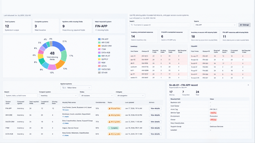
I turned the prototype into a working implementation for engineering
I developed the validated experience into a working implementation and pushed it to the frontend repository as a reference the engineering team could build from.
This gave the team both usable code they could build from and a shared reference for the intended design and behavior of the experience.
My intention was to reduce the distance between design intent and implementation.
For me, this was an extension of the same responsibility I had taken throughout the project: reduce ambiguity before it becomes implementation debt.
Reflection
The most important contribution I made was helping the team distinguish between three things that had started to become interchangeable: something the system could do, something stakeholders wanted, and something users had demonstrated a meaningful need to do.
I did not reject the multi-tool comparison requirement simply because the initial research had not validated it. But I also did not allow it to define the entire product before we understood the decisions and actions behind it.
The project also demonstrates an approach I have used throughout my work on complex systems: prototype fidelity should match the complexity of the behavior you need to understand.
When a workflow depends on complex data and interactions, I often move into code because a clickable prototype can limit the quality of feedback.
In this project, coded prototypes allowed me to test the reconciliation workflow with greater realism and expose assumptions and edge cases earlier. Once the interaction model was validated, I carried that work into a working implementation using the necessary repos and pushed it to the frontend team.
That meant engineering was not starting from static screens or rebuilding the interaction model from specifications. They had working code they could build from. On a tight delivery timeline, this reduced translation between design and development, helped save implementation time, and gave the engineers a more concrete starting point while preserving the intent behind the validated workflow.
That combination of research evidence, product judgment, interaction design, and technical fluency let me contribute beyond the traditional research-to-design handoff. I helped the team make better product decisions, validate them with users, and move the product closer to production in a form engineering could immediately work from.