WorkCase study
From powerful AI search to a trusted regulatory intelligence workflow
How I used UX research, product strategy, and interaction design to help a life sciences AI platform become easier to understand, trust, and use as part of real regulatory work.
- My role
I led discovery, product strategy, information architecture, and interaction design, reframing AI search as part of a broader regulatory intelligence workflow. I also shaped product feedback loops, positioning, and the website so the external story matched the experience inside the product.
- Team
UX, Data scientists, graphic designers, engineers, and the leadership team.
- Timeline
Approximately 12 weeks.
- Core constraint
Cedience had sophisticated AI technology, but the interaction model around it was still evolving.
As the platform evolved, the core search experience and the broader workflow around regulatory evidence still needed greater clarity.
We needed to make the existing value easier to understand and use without treating AI as a black box or adding more capability.
- Strategic decision
I moved the idea beyond “better AI search.” I designed around the broader regulatory workflow.
Search remained central, but it became the entry point into a repeatable workflow rather than the end of the experience.
Confidentiality note: Product terminology, research data, navigation structures, interface details, and implementation specifics have been anonymized, modified, or recreated. Some visuals have also been modified and presented at a lower resolution, while remaining representative of the original work and workflow.
Intro
Cedience was an AI-powered regulatory intelligence platform for life sciences teams.
Its technology helped drug-development teams search large bodies of regulatory information and find evidence-backed answers in minutes rather than the weeks or months traditionally required.
But the experience around that technology was not keeping pace with its capability.
Users struggled with the core search workflow. Some interactions were difficult to understand, and the product did not yet give regulatory professionals enough support around what happened before and after an AI-generated result.
At first, the most obvious problem appeared to be search.
The underlying challenge was adoption.
Users did not only need better access to information. They needed enough clarity and control to understand the results, preserve useful work, collaborate with others, and return to previous regulatory questions.
The work moved from improving an AI search interface to designing a more coherent regulatory intelligence workflow.
Impact at a glance
Stronger engagement after the redesign
Following the redesign, the team observed stronger engagement with the product.
Because the application, positioning, and broader product were evolving at the same time, I would not attribute the change to a single design decision.
Search became a more central product behavior
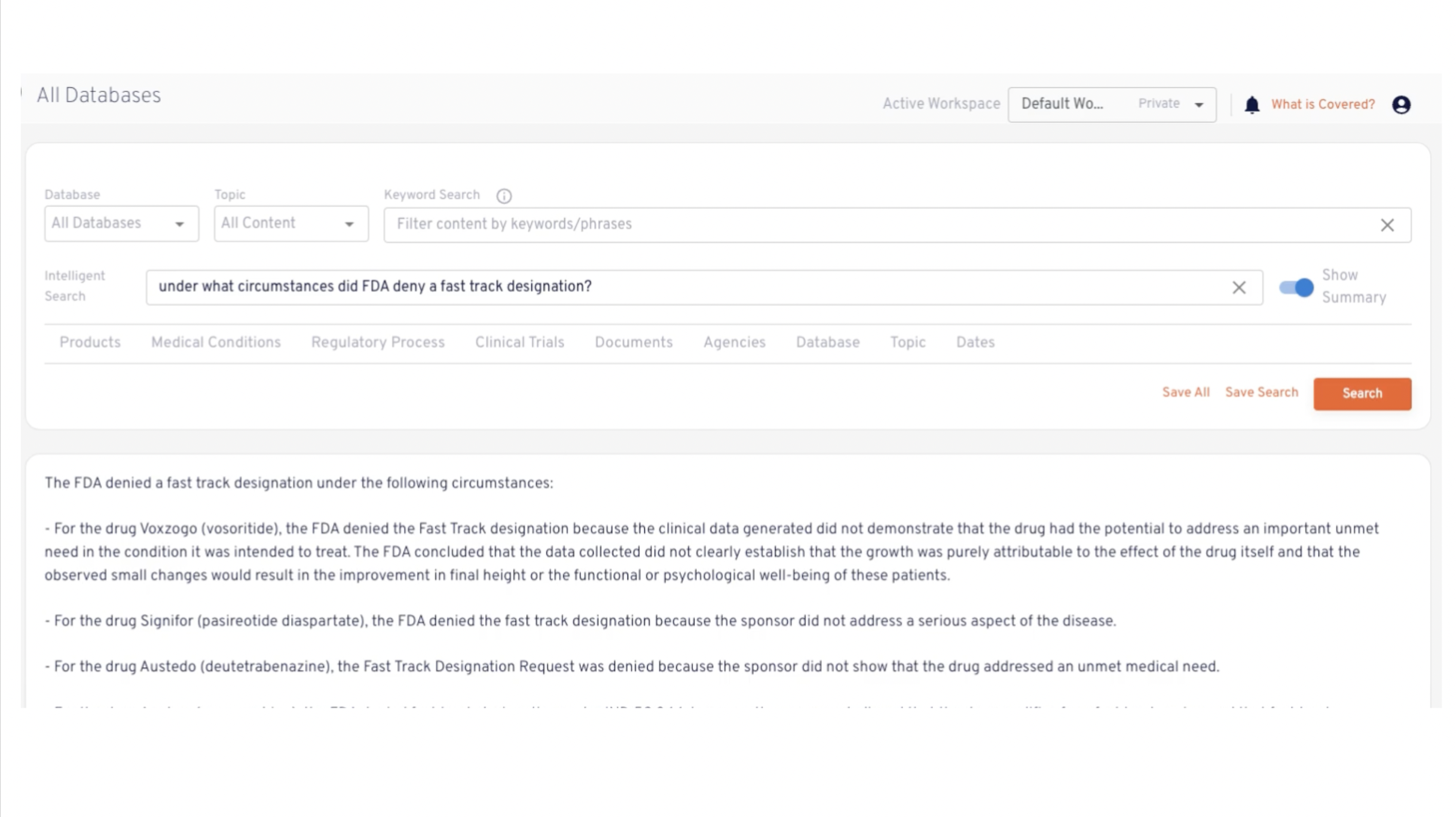
The redesigned experience made intelligent search easier to understand and positioned it more clearly within the regulatory workflow.
Collaboration created a reason to return
Collaborative workspaces gave regulatory teams a way to preserve research, share context, and continue working around the same questions over time.
The product became a more coherent system
The redesign connected search, saved work, collaboration, and feedback around one workflow.
Rather than behaving like a collection of AI features, the application began supporting what users needed before, during, and after a regulatory search.
The technology was powerful. The workflow around it was not.
Search was central to the value of the platform, but the search experience itself was confusing and frustrating.
That created an important contradiction.
Cedience could help regulatory teams retrieve useful information dramatically faster, but the experience surrounding that capability made the product harder to understand and trust.
For a regulatory professional, visual polish would not resolve that tension.
Trust depended on more practical questions:
- Can I ask the question I actually have?
- Can I understand the information I receive?
- Can I preserve useful evidence?
- Can I return to previous work?
- Can I share it with someone else?
- Can I retain control over how the AI fits into my decision-making?
The opportunity was to make the value of the AI legible.
Research to understand where the product was losing people
I combined user research, product analytics, and stakeholder discovery to understand the problem from several directions.
I wanted to know:
- what regulatory professionals were trying to accomplish,
- where the current experience was creating friction,
- how people understood the search experience,
- what made the system feel credible or uncertain,
- which capabilities people returned to,
- and what the team wanted the AI to do next.
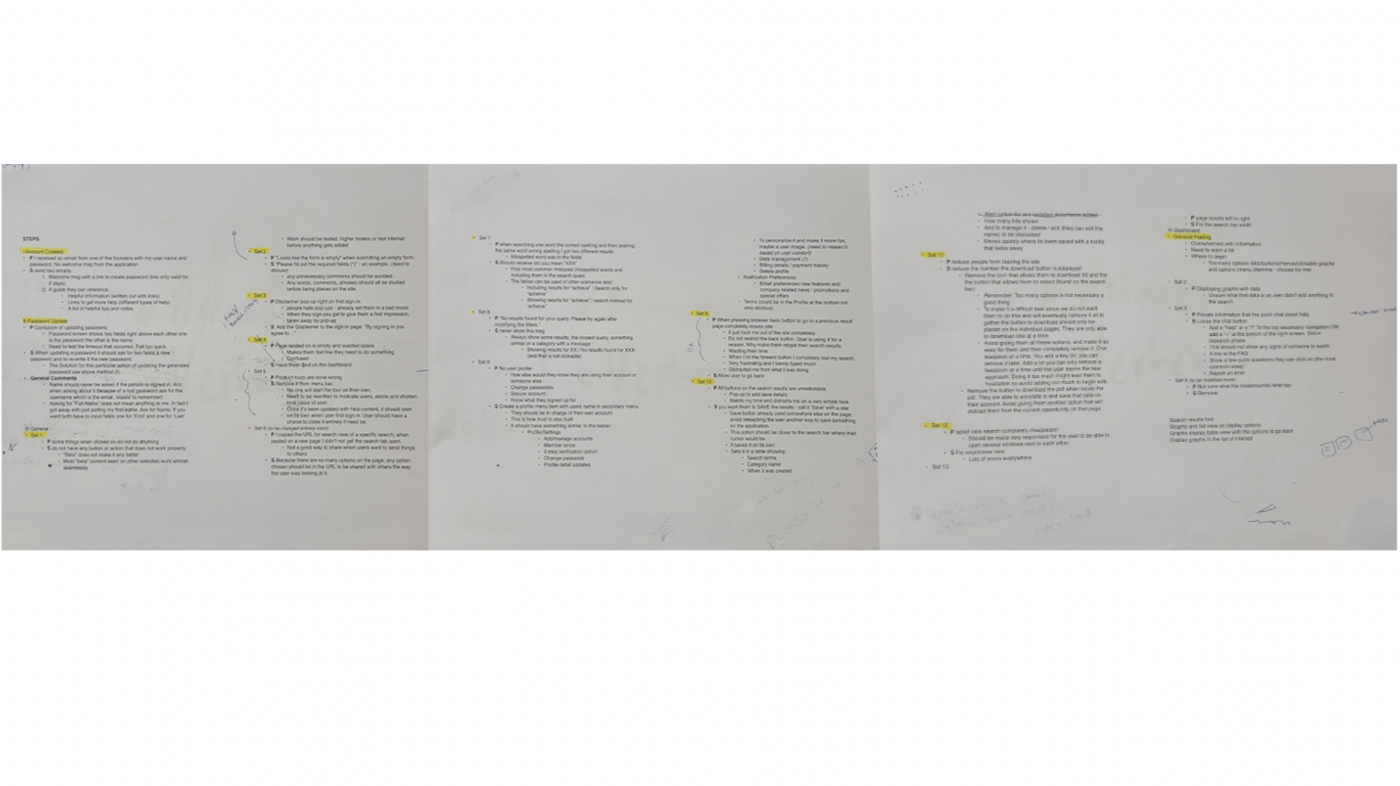
Across the research, analytics, and existing client feedback, the larger pattern was that Cedience had powerful capabilities that people did not always know how to use, interpret, or fit into their existing work.
Search was central, but search alone was not the job.
Users still needed to determine whether the evidence was useful, preserve important work, return to previous questions, involve other people, and maintain confidence in the process.
The path needed to help users find useful evidence, understand what they were looking at, save their research, collaborate on it, and return to it later.
That led to four connected product decisions:
- make semantic search easier to understand and use,
- allow useful searches and evidence to persist,
- support collaboration around regulatory questions,
- and create a lightweight feedback loop between user judgment and product learning.
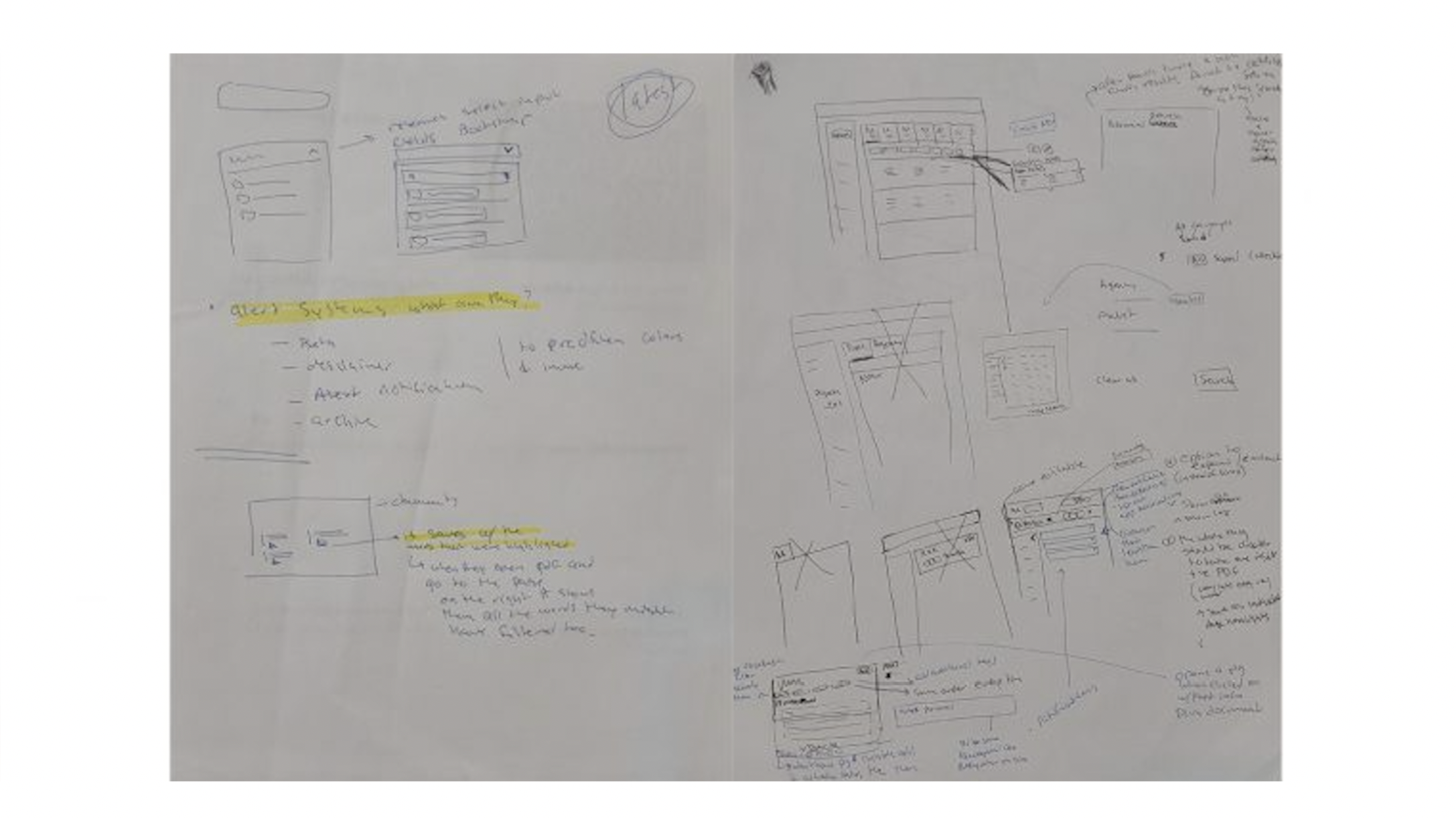
I chose not to solve the product as a list of features
Cedience already had a growing set of AI capabilities, and the team had ideas for adding more.
The risk was that we could keep expanding those capabilities without first clarifying the core interaction model.
Adding more functionality would not solve an adoption problem if users were still struggling to understand how the existing product fit into their work.
I used this product idea: Cedience helps regulatory teams move from complex questions to evidence-backed decisions faster.
That gave us a way to evaluate new ideas against the same question:
Does this make it easier for someone to understand, trust, or repeatedly use Cedience in regulatory work?
The application began to organize around that job rather than around the number of features available.
Make useful work persist beyond a single session
Important questions and evidence may remain relevant as a project evolves. Research and client feedback helped us discover the need for continuity rather than repeatedly starting from a blank search.
Saved searches gave users a way to preserve the context of previous work and return to questions that still mattered.
The product focused on building a body of regulatory work over time
That created another reason for users to return.
Design for the team, not only the individual searcher
Regulatory decisions often involve more than one person.
Collaborative workspaces extended that experience. Users could add collaborators, preserve shared context, and work together around regulatory questions.
The feature was valuable because it supported a real transition in the workflow:
individual discovery → shared understanding
It also created another reason for Cedience to become part of an ongoing process rather than a place someone visited for an isolated lookup.
Cedience later reported stronger retention associated with collaborative use.
Collect product-learning signals without interrupting the work
Cedience also needed to understand whether users considered its search results helpful.
That mattered to both the user experience and the data science team.
The easiest way to gather more information would have been to ask users for more of their attention.
I did not want feedback to become a separate survey or evaluation task.
Instead, I designed a lightweight in-product mechanism that allowed users to indicate whether a search result was useful while remaining in the workflow.
That created a connection between two goals.
The user needed a low-friction way to express judgment.
The product team needed a signal about result quality.
The feedback loop connected UX with the underlying AI system
The feedback mechanism was not only a UI control.
It created a relationship between the interaction experience and how Cedience could continue improving the product.
User judgment became a signal the team could analyze alongside product behavior.
The interaction needed to feel lightweight for the user while still producing information useful enough for the team to learn from.
The product story outside the application needed to match the workflow inside it
Cedience’s website and positioning also needed work.
The external product story also needed to communicate more clearly what the technology did and why it mattered.
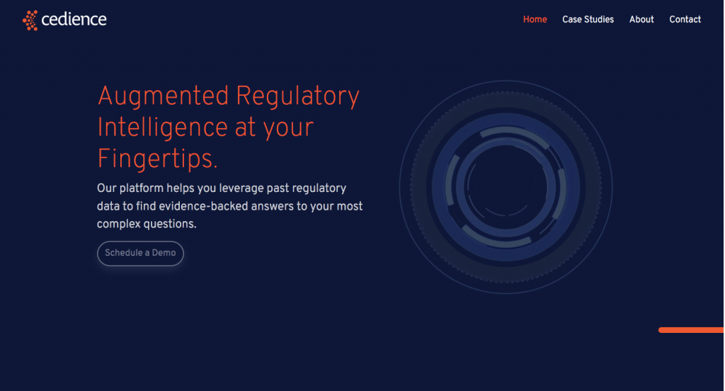
I supported the naming, positioning, visual direction, and website strategy so the external story aligned with the product direction.
The website needed to establish a clear enough mental model that the experience inside the application could deliver on it.
This work supported the product strategy rather than becoming a separate design story.
The application moved from a collection of capabilities toward a coherent workflow
The redesign included clearer information architecture, semantic search, saved searches, collaborative workspaces, and feedback.
They supported different parts of the same behavior.
A user could:
- ask a regulatory question,
- find relevant evidence,
- evaluate the result,
- preserve useful work,
- return to previous questions,
- collaborate with other people,
- and give Cedience a signal about the quality of the result.
Together, those changes moved the application away from a confusing AI search tool and toward a more persistent regulatory intelligence workflow.
Reflection
The most important shift in this project was moving from presentation and interface improvement to adoption strategy.
Cedience already had capable technology.
The design challenge was making that capability understandable enough to try, trustworthy enough to use, and useful enough to return to.
Research helped make that distinction visible. It changed the work from interface improvement into a broader product decision.
The project also reinforced something I consider particularly important in AI products.
Trust is not a visual treatment. It is created through the relationship between what a system promises and what a user can understand, control, preserve, question, and act on.
Semantic search was important. But the stronger product emerged from what we designed around it: continuity, collaboration, feedback, and product learning.